
Today's Comic Book Sunday is not all comic books, but it is a collection of the newsletters of Steve Cook called "Secret Oranges."
Like many of the good things in life, Cook came to my attention from Warren Ellis' excellent newsletter "Orbital Operations."
Best known for his work in the comics field, Cook was art director and designer for the British comic 2000 AD (1988–2001)."
 |
Sometimes I buy books to read, and sometimes I buy them purely for the cover art and design. Here are a few more of my favourites. Some of them are pristine, some are battered, but I really don’t mind.
 |
From my bookshelf; a 1966 copy of Up The Junction by Nell Dunn with one of my favourite book cover illustrations from the period, but - there's no artist credit as usual.
 |
Monkey Planet by Pierre Boulle. Penguin edition 1970. Designed by Ivan Atanasoff. This year is the 60th anniversary of the book first published in France in 1963 as La Planète des Singes. As it says on the cover - the book that inspired Planet of the Apes in 1968 and everything that followed.
 |
Escape From The Planet Of The Apes was definitely one that followed. 1973.
 |
Inside MAD. Another favourite from my bookshelf. This printing from 1961.
 |
Ode to Billy Joe. 1976. I have a movie poster for this one too, with a lovely uncredited painting. Ideas anyone?
 |
From 1961, the Pan book: Ellery Queen's 'The Origin Of Evil'. Art by Sheldon.
 |
I bought this solely for the cover painting by an artist credited only as ‘Thomas’. There's something so incredibly wonky about the hand drawn logo that I find strangely appealing. Analog (British Edition) - August, 1962.
 |
The Reluctant Tease. This one, a first edition from 1965. Great art style of the period but (as usual) not a mention of the cover artist anywhere. What is it with these publishers? A simple credit for the artist is not exactly a big ask!
 |
Corpus Earthling. A science fiction horror novel by Louis Charbonneau (1960). I originally bought this book for its retro cover art, though try as I might, I can't seem to find out who did it. I know who's work it looks like, but I need to do a bit more research to establish if I'm correct or not. What I did discover however, is that this seems to be quite an important novel and was apparently adapted for an episode of the classic 1960s television show The Outer Limits. The episode, ‘Corpus Earthling,’ aired on November 18th, 1963.
 |
if. 1954. I found this in the basement of an old bookshop on Charing Cross Road, London. The art is by someone called Kenneth Fagg and is titled The Old Spaceman's Tales. He's an artist that I'm not familiar with, so a little bit of online research tells me that he was a brilliant cartographer who worked for Life, Saturday Evening Post and other national magazines. This UK edition includes ‘The Thing in the Attic’ by James Blish.
 |
Pigeon’s Luck. 1973. I first saw Tretchikoff’s framed prints for sale in 'Boots the Chemist' as a kid and they left a lasting impression. I have three of his hanging on my wall back in London.
 |
A Clockwork Orange. 1972. I spotted this classic book cover, designed by David Pelham in the window of a shop in St Leonards-on-Sea, just as I was about to get a train back to London, but it was closed! Thanks to Alexander Brattell for collecting it from the shop for me the very next day, before anyone else could grab it.
 |
I was thrilled to find this rather large hardback tome in my local charity shop back in London, for two quid. A Viking, American edition of Desperation by Stephen King, featuring a Mark Ryden cover. A winning combination!
 |
She moves with trained-to-kill reflexes, clicks with an IBM brain. She's cool, ingenious... and sexy. She's a pro from the top of her beautiful head to the tip of her painted toenails. She's Mr. Waverly's right-hand girl and her heart belongs to U.N.C.L.E. (back cover text). Stephanie Powers as April Dancer, The Girl from U.N.C.L.E. 1966. I love the simple design of this, especially the fact that it's orange.
The Landing at Halo Cradle
and other tales


Welcome to 1976, and the story behind my first published photo.
The editorial piece above, is of course a jumbled-up version of the story I actually told, and from my strong recollection of the day, I’ll try to explain how it all went down.
My Mum, Dad, brother and I were all in a car, traveling back from a place called Oundle, a market town in Northamptonshire, England, having just visited Arthur the Lighthouse Keeper (mentioned in a previous post). At some point my mum spotted what looked like a small white parachute descending beneath the clouds. We thought it odd at the time because there were no airplanes in sight from which someone might have jumped. About five minutes later my dad brought our attention rather abruptly to what looked like three grey disc like objects floating downwards side to side like falling leaves, but they seemed to disappear and reappear again as they did so. The worrying thing was, that if they kept descending this way they’d eventually land on the motorway up ahead. As alarming as this was, it seemed that all of the other cars were completely oblivious to what we were seeing. I hastily reached into my bag for the 110 Prinzmatic camera I had at the time, and as I did so, I was suddenly aware of a large grey disc-like shape moving through the low cloud cover to my right. Not hesitating, I started snapping away until most annoyingly we went down through an underpass for what seemed like an eternity! As we came back up the other side they were all gone, as if they’d never been there at all.

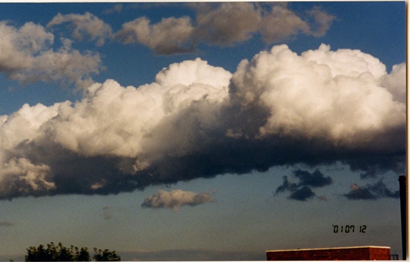
We pulled over into the nearest lay-by and all got out of the car to see if we could get another glimpse of them. As I looked up, I was sure I saw a large dark shadow move behind the clouds above. I quickly pointed to it, but no-one else saw it in time. We decided that whatever we’d seen before was long gone and we got back into the car to continue our journey. I don’t remember the exact timing of this, but somewhere along the way my father made us all aware of a cloud that seemed to have a large dark shape hidden within. He suggested I photograph it, which I did, after slowing the car and giving me a chance to wind the window down.
On returning home, the whole experience had made us all feel odd and a little uneasy. This wasn’t the first time I’d seen unidentified flying objects. There was a sighting of two glowing orange discs seen by all the kids in the playground at my junior school, but this seemed somehow more surreal.
At this point I had a job in a large department store called Debenhams, as a junior display artist, and when I went into work the following day I was keen to tell my colleagues of the experience. I also told them I’d taken photos and was hoping to have some solid evidence after the film had been developed. That lunchtime I took my film over the road to a camera shop for processing. I explained what I hoped would be on there and the shop assistant wrote instructions for the lab to print the whole film regardless.

The wait to collect my prints was unbearable, but a day later I hurried over the road to collect them. I’ll be honest, the results were pretty disappointing. All of the photos I thought I’d taken of the large object were devoid of a large object, but instead just blurred foliage and sky. It made sense because the car had been moving pretty fast at the time and the camera was certainly not an SLR. But, the photo that I’d taken of the cloud with the dark shape revealed something else entirely. Though blurred, the saucer shape was definitely there, but the weird effect below it was not something that we saw with the naked eye. Why this should only register on film is a complete mystery.
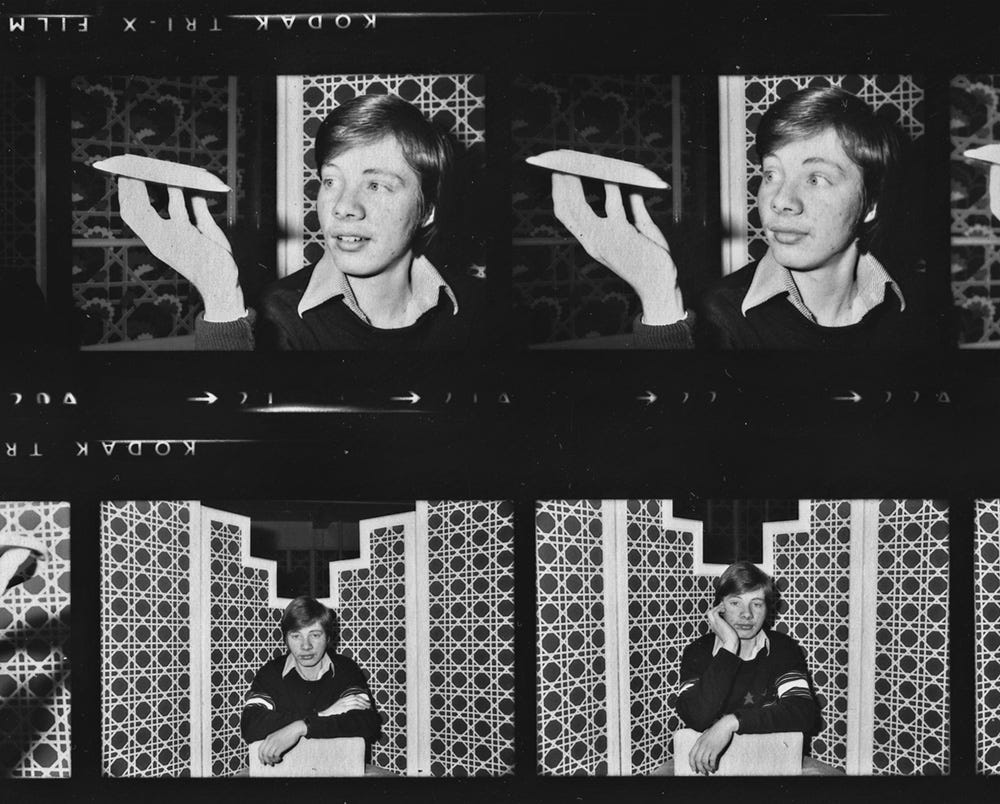
When I showed the display manager he was thoroughly intrigued, and said he thought it would make a good story for the weekly Debenhams newspaper, so he called them up and arranged for me to be interviewed by one of their reporters. I also had an extra print made to give to their photographer who was to travel over to take my portrait.

A few days later, a rather eccentric American journalist turned up with all his camera gear to take photos for the Debenhams News article. He decided the out of hours staff restaurant was the quietest location to use, plus it had the added bonus of low hanging lights and kitchenware he could utilize. This rather insane photo above was his idea for an action shot, that had me pinned against the wall in terror while he swung the lamp back and forth in front of me, like an alien craft in motion. In retrospect, why I agreed to this is beyond me, but in my defense I was still a teenager. He also did some slightly more low key portraits of me holding… yes, a saucer!
So that’s the story as best as I can remember it. It would be nice to think we witnessed a sighting of alien craft, but I honestly don’t know what we saw, which is why unidentified flying object or unidentified aerial phenomena is a good term.

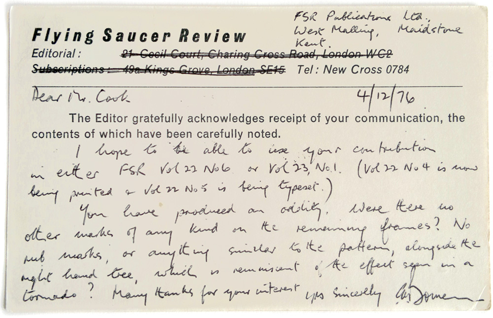
I decided to get a subscription to Flying Saucer Review now that my interest in the subject was piqued, because I’d already sent the photo and my account of the experience to its well respected editor, Charles Bowen. He’d written back a couple of weeks later, saying that he thought I’d produced an oddity and that he hoped to use it at a later date, though it never seemed to make it into the magazine itself. Here’s the postcard.
Fast forward to 1998 and a trip to a London nightclub called The End, which was co-owned by Mr. C of The Shamen fame. I can’t remember what the night was celebrating, but I know it had something to do with Aliens, because they had these amazing (life-size?) statues of Grey Aliens planted in various locations around the dance floor. I was there with Grant Morrison that night because we’d often go clubbing whenever he was down from Scotland, and I remember saying how much I wished I could own one of these.
The following day, I had to go to Camden Town for some reason or other, and just a short walk from the train station I noticed a kind of pop-up junk shop, and there, in the window was one of the Grey Alien statues. I couldn’t believe my eyes! I went in and asked how much it was, and if it had appeared at the club the night before. I was told that it had, which explained a little bit of paint damage, but apart from that it was fine, and not too expensive either, so I decided there and then to buy it. I asked after the sculptor but they had no idea who’d actually made it.

By this time I was really getting into Photoshop manipulation so I decided to create an image using one of my photos taken in Thailand as a background and superimpose three of these grey aliens. I called it The Landing At Halo Cradle. It’s early work, and I could do much better now, but I’d recently met a writer who was doing a book about UFOs and he wanted to use it to illustrate one of the articles in his book. I was pretty happy about this, and at some point I told him about my own experience and the newspaper article. He was keen to hear my story and see the photo, after which he suggested including this in his book as well. By now, since the X-Files tv show and the whole alien abduction scenario was a part of the zeitgeist, he wondered if we’d experienced any missing time during our sighting back in 1976, and subsequently thought it would make a great article if he were to have me hypnotically regressed to that very day.
It did spark my curiosity and I thought it was a cool idea, but I’d had someone try to hypnotize me in the past and it never worked. I told him this, but he wanted to give it a try anyway. The publisher was really not keen on funding this madness at all, but he somehow managed to persuade them to pay the fee, and off we went to visit a professional hypnotist, whose name I cannot recall.
I’m sure he was a good hypnotist, but for me it didn’t work. I tried to visualize it, but that’s all I was doing; trying to visualize it. The author was majorly disappointed, I could tell, but it didn’t work and that was that.
Time went by and whenever I was in a bookshop or library, I’d look out for the book, but to no avail. I began to wonder if it had even made publication, then by chance I bumped into the author on the Tottenham Court Road underground platform one evening. I asked him what had happened, and he explained that the book had only been published in America. He apologized for not getting me a copy, and promised he’d try and get the publisher to mail one to me.
A couple of weeks later the book arrived in the mail, and I was horrified to see that the section that featured my UFO photo and text about the hypnosis was complete and utter bullshit. The writer had obviously made stuff up so he could justify the expense of the hypnosis session to the publishing house. I was so angry, in fact I’m still angry about it now, but what I’ve learned from this, is to question everything I read in ‘factual’ books of this nature, because reporters can just make shit up if it suits their agenda.
I don’t have a copy of the book here in California, and I thought about ordering one online, so I could transcribe the nonsense he’d written, but I decided I just don’t want to see it and get pissed off all over again. The one redeeming factor is that it looks to be remaindered, with a price of only $5 bucks! So obviously not a big seller, or a classic.
The reason I’m not mentioning the author’s name or title of the book is because I did bump into the guy one more time, on that same underground platform a few months later. He looked incredibly sheepish and uncomfortable, and when I approached him, he admitted that he owed me an apology. I don’t like having ill-feeling towards anyone, so I’ll just leave it at that. I’ve learned my lesson, and now that I have substack, I’ve set the record straight for my own peace of mind, if anyone should come across the book by chance.
Thankfully, in recent times, UFOs or UAPs as they’ve tried to rebrand them, are finally being taken seriously at last. It’s a funny thing but although I now have the technology to easily create fake UFO photos I always feel uncomfortable about it, for fear of undermining the shot that I took in 1976. Despite that, here’s a ‘photo’ that I really enjoyed conjuring up for The Wild Storm by Warren Ellis and Jon Davis-Hunt when I was designing the collected edition for the opening spread of Vol.4.

I guess I’ll never know what exactly we experienced. It remains a mystery, but at least I had one photo that showed evidence of something unusual. I’m just thankful that even then I usually carried some type of camera with me.

I’ll finish up with this 30 second soundbite from an old tv or radio commercial about alien abduction that John Tomlinson sent me. I don’t know what year it’s from, but voiceovers back then just sounded so terribly British!
In the late seventies I was so into Marvel and DC comics, that I didn't really notice the British artists until I saw Brian Bolland's artwork. Firstly on the paper bags for the Forbidden Planet comic shop that I’d visit, during my time as a student at college in the Charing Cross Road, London.
 |
Dark They Were and Golden Eyed in St Anne's Court, was the first comic shop I’d found, and I still have one of their paper bags (below), designed by James Cawthorne, (an artist primarily associated with Michael Moorcock), but the new Forbidden Planet was nearer, in fact just over the road from the Saint Martin's School of Art building.
 |
Here are some images of flyers and bags for Forbidden Planet by Brian Bolland that I’ve kept cuttings for, along with many other examples of his earlier work.
 |
 |
Apart from the work Bolland did for Forbidden Planet, it seems he was all the rage when it came to comic shop flyer artwork. Here's one for Comic Showcase, that I've kept since 1980.
 |
 |
From Forbidden Planet 2, where I met Richard Hollis and Alan Jones who worked there, known also for their regular features and reviews for Marvel UK’s Starburst magazine.
 |
Not long after I’d started at Marvel UK, artist and writer, John Higgins was kind enough to take me along to a meeting at The Society of Strip Illustration (SSI), later known as the Comics Creators Guild. I was given a copy of their directory, and inside was this great illustration of Morgan LeFay from the Camelot 3000 series published by DC Comics. A series that I’d been reading, and still have, somewhere back in London.
 |
 |
From the same album of cuttings, a Time Out cover by Bolland. Sept 1987. Squashed and stretched type was all the rage around this time, thanks to Neville Brody. I’m glad it went out of fashion eventually, though I'll admit that I too was guilty of it for a short while.
 |
This pmt (photo-mechanical transfer) has yellowed with age somewhat. It probably wasn't fixed for long enough. Anyway, Bolland does Dredd!
 |
From David Anthony Kraft’s Comics Interview #19. Such a fun cover illustration.
 |
The Dark Knight Rises... and how!!! Brian Bolland for the UKCAC '85 convention booklet.
 |
A page from the Birmingham comics convention booklet, 1986.
 |
A copy of a PMT for Eagle Comics Presents: Judge Dredd #3, January 1983.
 |
Eagle Comics Presents: Judge Dredd #28, February, 1986.
 |
And lastly, a production proof for 2000 AD Prog #848, 4 Aug, 1993. I remember this being commissioned by Alan McKenzie at the time, and I still (luckily) have Brian's incredibly detailed fax, that I used for the cover layout ahead of the finished art arriving at the command module.
 |
This particular cover also appeared as the frontispiece and in the chapter entitled 2000 AD, in a book by The V&A. The Art of the Book. James Bettley, ed. V&A Publications. ISBN: 1851773339
Thanks for reading Secret Oranges! Subscribe for free to receive new posts.
"This Man...This (Purple) Monster!"
Lurking amongst my childhood comics I found an intriguing item; The Fantastic Four - A Full Colour Comic Album. The only problem being, that the 'full' colours are completely and utterly wrong! The rather naive cover also mentions that this is an 'Authorised edition'. Really? I can't imagine Marvel ever agreeing to a purple Thing, a blue Human Torch or a Blue Surfer for that matter. Having said that, I obviously kept it for a reason and it certainly wasn't the cover.
 |
There is actually something quite fascinating about seeing such classic Jack Kirby & Joe Sinnott artwork with a totally nuts colour scheme. I'm going to post a few excerpts from this and I'm sure you'll agree.
 |
Not sure about that ‘logo’, it looks a bit wonky… actually it all looks a bit wonky.
 |
I’m really intrigued now, to know how this page was supposed to look. It’s an awesome page, even with an unfamiliar colour scheme.
 |
I give you, ‘He who wields the Power Cosmic’, the one and only Silver?!? Surfer!
 |
Another one with a totally bonkers colour scheme. A green Black Panther and a Human Torch who is obviously propelled by natural gas!
Reed's Wrong Dimension
 |
Oops!
 |
The Pink Pants of Mister Fantastic
You’d think one book’s worth of chromatic aberrations would be enough, but no… I present another obscure British book discovery. The Fantastic Four™ Television Picture Story Book, and a garish over-saturated interpretation of:
 |
The Fantastic Four #56, November, 1966. "Klaw, the Murderous Master of Sound!" Script: Stan Lee. Pencils: Jack Kirby. Inks: Joe Sinnott. Letters: Artie Simek.
As a respite from all that vivid colour, I’ll finish with some monochromatic daftness. This is a PMT of a comics panel that I kept from my time at Marvel UK all those years ago. I have no idea what it’s from, but it always makes me laugh for some obscure reason. Ideas, anyone?
 |
All artwork © Marvel Comics
A few moons ago, on my original blog, I had a habit of posting enlarged panels from some of my favorite comics. Not only do they look cool that way, but you really get a glimpse of the seemingly effortless techniques of the artists with this kind of detail, so I’m doing it again…
 |
Amazing Spider-Man #44 - January, 1967. Story: Stan Lee. Art: John Romita Sr. Letters: Sam Rosen.
 |
Las Aventuras de Dieter Lumpen – Caribe (1989) Script: Jorge Zentner. Art: Ruben Pellejero.
 |
Kill Your Boyfriend (1995) Script: Grant Morrison. Pencils: Philip Bond. Inks: Philip Bond & D'Israeli. Colours: Daniel Vozzo. Letters: Ellie DeVille.
 |
The Rupert Adventure Series No.2, 1949. Rupert and Uncle Bruno. Art: Alfred Bestall.
 |
Judge Dredd: Midnight Surfer (2000 AD #424-429, 1986) Script: John Wagner & Alan Grant. Art: Cam Kennedy.
 |
Bill Finger and Wayne Boring’s “The Girl in Superman’s Past”. DC Comics. Superman #129, 1959.
 |
The Dark Knight Returns, 1986. Writer: Frank Miller. Penciller: Frank Miller. Inker: Klaus Janson. Colourist: Lynn Varley. Letterer: John Costanza.
 |
From a Production Stat for Ms. Marvel #1 - January, 1977. Script: Gerry Conway. Pencils: John Buscema. Inks: Joe Sinnott. Letters: John Costanza.
 |
Starstruck "The Luckless, The Abandoned, and the Forsaked", 1982. Writer: Elaine Lee. Artist: Michael Wm. Kaluta.
 |
The Daily Mirror Book of Garth (1975) - The Cloud of Balthus. Art: Frank Bellamy.
 |
Oh, Wicked Wanda! (Panel Detail) First Series (1973). Script: Frederic Mullally. Art: Ron Embleton.
 |
Heavy Metal Magazine - August, 1981. The Nikopol Trilogy: The Immortals' Fete. By Enki Bilal.
 |
And last but not least, Doctor Strange, Into Shamballa, (1986) Story/Script: J.M. DeMatteis. Story/Art: Dan Green.
In memory of Dan Green who we lost a few days ago, here are a couple of photos I took, when alongside John Romita Jr. and Annie Nocenti, Dan visited us at Marvel UK in Redan Place, London, way back in 1985.
 |
R.I.P. Dan Green. November 26, 1952 – August 19, 2023.
 |
All comic art © their respective publishers. Photos © steve cook 2023
+++++++++++++++++++++++++++++++++++++++++++++++++++++++++++++++++++++++
+++++++++++++++++++++++++++++++++++++++++++++++++++++++++++++++++++++++
- Bloggery committed by chris tower - 2310.01 - 10:10
- Days ago = 3012 days ago
- New note - On 1807.06, I ceased daily transmission of my Hey Mom feature after three years of daily conversations. I plan to continue Hey Mom posts at least twice per week but will continue to post the days since ("Days Ago") count on my blog each day. The blog entry numbering in the title has changed to reflect total Sense of Doubt posts since I began the blog on 0705.04, which include Hey Mom posts, Daily Bowie posts, and Sense of Doubt posts. Hey Mom posts will still be numbered sequentially. New Hey Mom posts will use the same format as all the other Hey Mom posts; all other posts will feature this format seen here.
No comments:
Post a Comment